Editing Panels
Once a panel is added to your dashboard you'll want to alter you dashboard and/or panels to make analyzing your data as efficient as possible. This may involve rearranging panels, changing visualizations to a different chart type, or even adding inputs (more on that to come).
Chart formatting
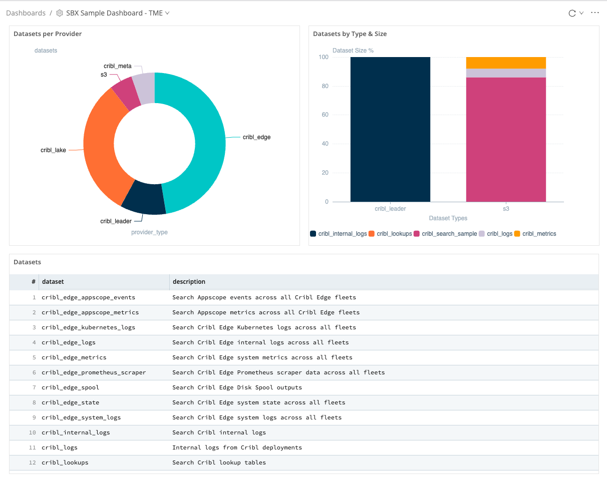
Let's take a look at how to edit dashboard panels by continuing on with our Datasets by Type & Size panel that we added previously.
- Click the
dashboard options icon at the top right of the page.
 - Click
Edit. - Click the
edit icon at the top right of the
 Datasets by Type & Sizepanel. - Set
TypetoBar. EnabletheStack seriestoggle.- Set the following
X-axis options.- X-axis field:
datasetType - Title:
Dataset Types - Position:
Bottom
- X-axis field:
- Set the following
Y-axis options.- Title:
Dataset Size % - Scale:
Linear - Show gridlines:
On
- Title:
- Under the
Legend optionssetPositiontoBottom. - Click the
Xat the top right of theEditwindow to close the modal.noteEach
charttype has its own set offormatting options. It would be a great idea to familiarize yourself with them using the charts documentation
Great! without editing our query we've changed our unuseful events panel into a stacked bar chart. With this we can easily view what percentage of a datatype's size each dataset accounts for. Since we are happy with the way this visualization is configured let's save our work.
- Click
Saveat the top right of thedashboard editor.
Arranging Panels
Choosing the right visualizations is only one piece of the puzzle. The layout of the panels will also play a large roll in how quickly you analyze your data. Our dashboard could definitely use a little help in that department.
- If you are not still in
Editmode, click thedashboard options icon at the top right of the page. - Click
Edit. - Click and hold the bottom right or bottom left
cornerof theDatasets per Providerpanel and drag until the panel ishalf the widthof the page.noteEnsure you can still see the entire
donut chart. Draggingverticallymakes the paneltaller/shorterwhile dragginghorizontallymakes the panelwider/narrower. - Repeat this for the the
Datasets by Type & Sizepanel. - On the
Datasets per Providerpanel, click and hold the panel bar at the top center of the panel and drag to the top left position of the dashboard.
 - Repeat this process to move the
Datasets by Type & Sizepanel to the top right position of the dashboard.
Great! If all went well (and seeing that you are strong with The Force there is no reason it wouldn't) then you should have a dashboard that looks something like the image below.
Feel free to play around with resizing and rearranging the panels. As we continue it will be up to you on where to place the additional panels. There are no wrong answers padawan. Trust in The Force.