Chart Types
A Picture's Worth 1,000 Logs
It's nearly impossible to look at millions of raw events and come up with a conclusion on what the data is trying to tell you. Charts are a way to visualize aggregated results, facilitating quick understanding of large datasets. Charts come in many shapes and sizes, and depending on the data and the use case, different charts may prove more useful than others.
Charts are used in conjunction with the summarize, eventstats, and timestats operators to aggregate your data.
If you can recall from the Cribl Search Overview sandbox, when you use an aggregating operator, Cribl Search automatically switches the view of the results pane from the Events Tab to the Charts Tab.
Let's take moment to review the different chart types available to you in Cribl Search.
Tables
A table is a way to visualize data in a tabular format. In an ad-hoc search, a table is provided below every chart type on the chart tab of the search results page.
Tables are great for when you want to see a textual summarization of the data.

There's a ton of ways tables can be formatted to make analyzing data easier. These will be covered later.
Bar Charts
Bar charts just might be a data jedi's best friend. A Bar chart is best used for categories of data, either comparing the distribution of values over time or another category.

Bar Chart Sample Query
dataset="cribl_search_sample" dataSource="access_*"
  | limit 10000

// Parse method, uri, and scheme from the request field
  | extract source="request" type=regex @'^(?<method>.*?)\s(?<uri>.*?)(?:\s|$)(?<scheme>HTTP.*?)?$'

// Generates hosts for demo purposes. Remove for real world use.
  | extend num = rand(3),
    host = case(num == 0, 'web01.cribl.io', num == 1, 'web02.cribl.io', 'web03.cribl.io')
// End of host generation

  | summarize cnt = count() by method, status, host
  | pivot cnt over method by host
Area Charts
An Area chart is similar to a Line chart, except the area representing values is filled in with the selected color. These are suited for data that accumulates, not so much for highly fluctuating data.
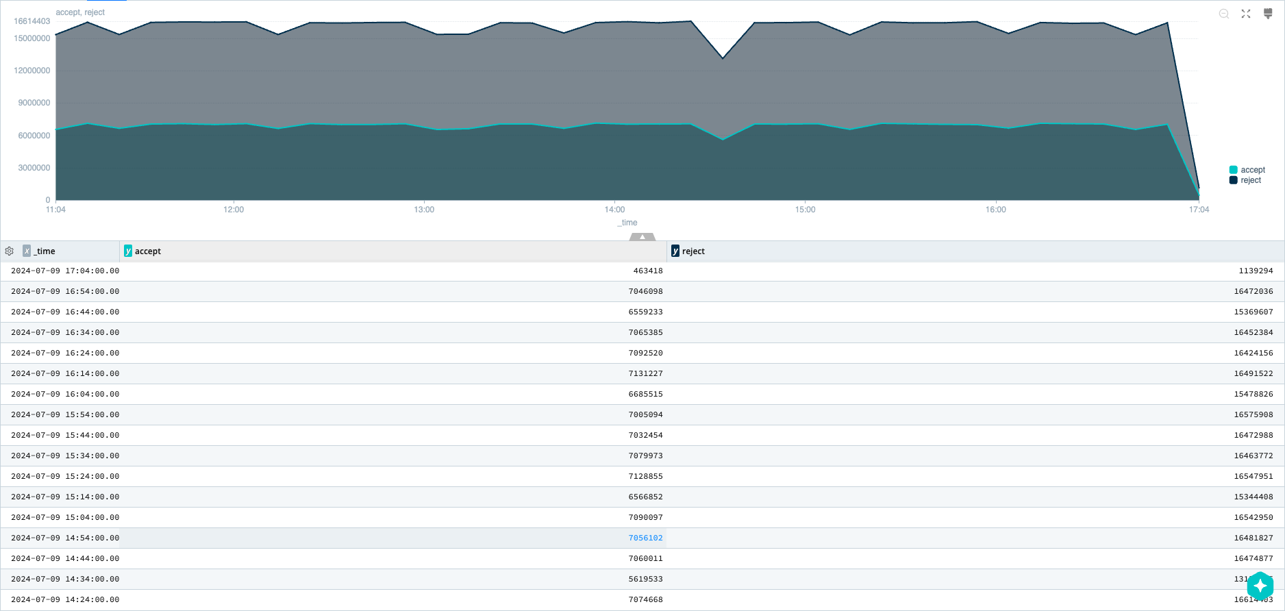
Area Chart Sample Query
dataset="cribl_search_sample" dataSource="vpcflowlogs"
  | timestats span=10m accept = sumif(bytes, action=='ACCEPT'), reject = sumif(bytes, action=='REJECT')
Line Charts
A Line chart is ideal for visualizing data over time, such as hardware usage and error events. These charts work well with large and continuous sets of data.
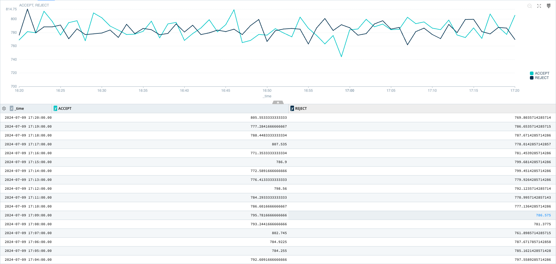
Line Chart Sample Query
dataset="cribl_search_sample" dataSource="vpcflowlogs"
  | timestats span=10m accept = sumif(bytes, action=='ACCEPT'), reject = sumif(bytes, action=='REJECT')
Donut Charts
Donut charts summarize how a total amount is divided into numerical proportions. Use a Donut chart when you want to compare parts of a whole against the whole and its other parts, such as the distribution of operating system usage.

Donut Chart Sample Query
dataset="cribl_search_sample" dataSource="access*"
  | limit 10000

// Parse method, uri, and scheme from the request field
  | extract source="request" type=regex @'^(?<method>.*?)\s(?<uri>.*?)(?:\s|$)(?<scheme>HTTP.*?)?$'

// Generates hosts for demo purposes. Remove for real world use.
  | extend num = rand(3),
    host = case(num == 0, 'web01.cribl.io', num == 1, 'web02.cribl.io', 'web03.cribl.io')
// End of host generation

| summarize cnt = count() by method
Funnel Charts
A Funnel chart helps visualize how data values move through a process in stages. Funnel charts are useful for monitoring data that moves through a linear process in sequential, connected stages.
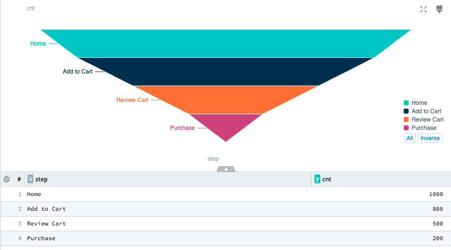
Funnel Chart Sample Query
dataset="$vt_dummy" event < 4

// Generates demo data for shopping transaction steps
  | extend data =
   case(event == 0, dynamic({"step": 'Home', "cnt": 1000}),
        event == 1, dynamic({"step": 'Add to Cart', "cnt": 800}),
        event == 2, dynamic({"step": 'Review Cart', "cnt": 500}),
                    dynamic({"step": 'Purchase', "cnt": 200}))

  | summarize cnt = sum(data.cnt) by step = data.step
Gauge Charts
Gauge charts (also known as dial or speedometer charts) show progress toward a specific target or metric, displaying a specific value as a measure of progress toward that target.
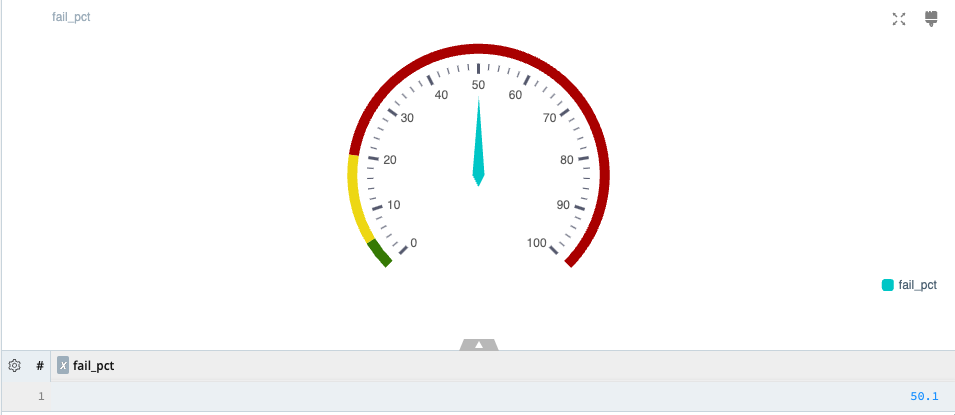
Gauge Chart Sample Query
dataset="cribl_search_sample" dataSource="access*"
  | limit 1000
  | summarize total = count(), fail = countif(status >= 400), success = countif(status < 400), fail_pct = round((fail / total) * 100, 2)
  | project fail_pct
Map Charts
Map charts use geographical maps to display data points or categories associated with specific geographic locations.
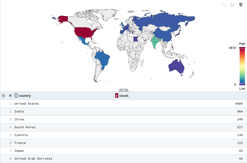
Map Chart Sample Query
dataset="cribl_search_sample" dataSource="access*"
  | limit 10000
  | ip-lookup geocity on clientip
  | summarize count() by country
To create Map charts, your search needs to return supported geolocation data. You can use the ip-lookup operator, which references geolocation data from MaxMind’s databases.
To try this example:
- Sign up for a free Maxmind Account
- Download the GeoLite2 City zip.
- Import the
GeoLite2-City.mmdbfile into Cribl Search as alookupcalledgeocity.
Scatter Charts
Use a Scatter (or scatter plot) chart to determine whether two numeric variables in a set of individual data points have a relationship or correlation. Dots or circles represent these data points.
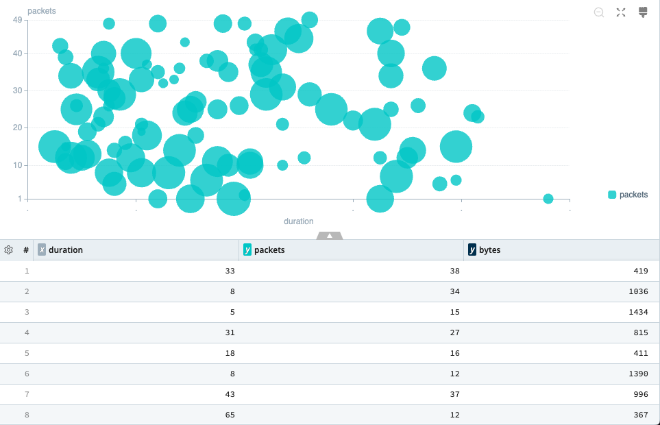
Scatter Chart Sample Query
dataset="cribl_search_sample" dataSource="vpcflowlogs"
  | limit 100
  | extend duration = toint(abs(end - start))
  | project duration, packets = toint(packets), bytes = toint(bytes)
Single Value Charts
A Single value chart allows you to display one search result; if there is more than one result, the first result is charted. These are helpful when you have an important value to track.
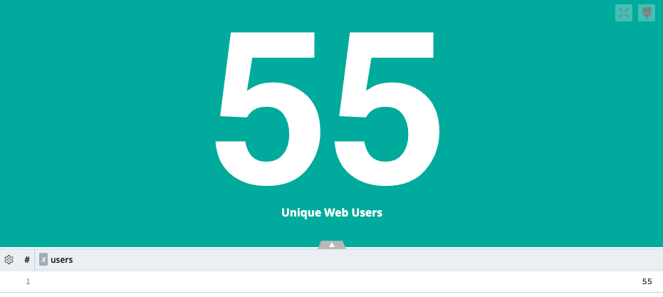
Single Value Chart Sample Query
dataset="cribl_search_sample" dataSource="access*"
  | limit 1000
  | summarize users = dcount(user)
With so many chart types at your disposal you are sure to have all the tools you need to conquer your data.
Feel free to play around with any of the above visualizations using the provided queries. After running the search, change the Type field to the appropriate visualization.